![]()
2. Image Display and Enhancement using ENVI 5.5
Department of Geography
University College London
2.1. Aims
After completing this practical, you should have a reasonable idea of a range of basic functions within an image processing software, envi. You should also have started to make some sense of how the theory you are learning in the lectures can be used to manipulate image data.
2.2. Data
The datasets you need for this practical should be available to you on moodle ( https://moodle.ucl.ac.uk/mod/folder/view.php?id=2700004):
and you will need to download them into your personal N: Drive, e.g. N:\GEOG0027\data.
The data you will be using are:
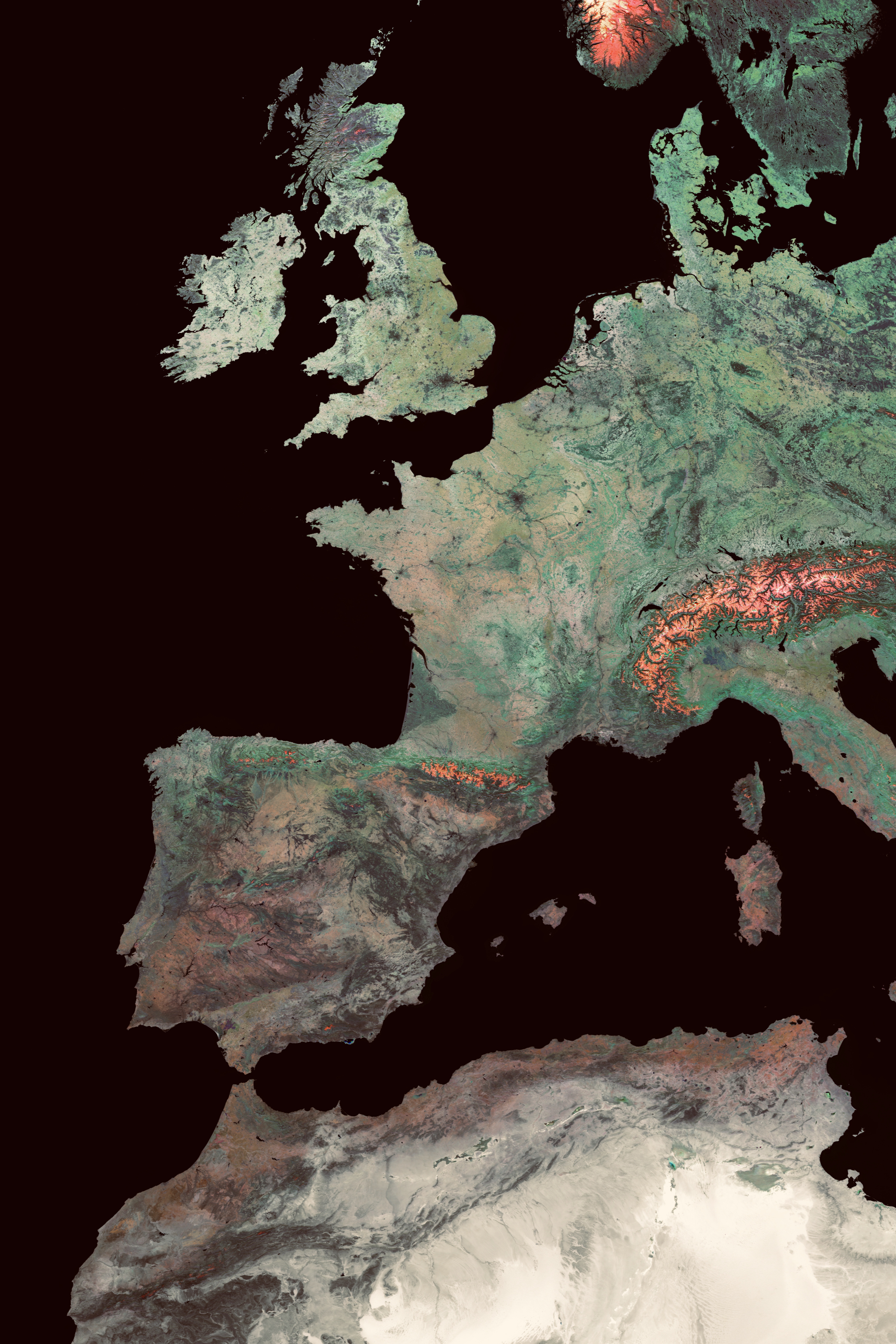
six wavebands of a Landsat TM image over Greater London, imaged on May 28th 1989. The data were obtained from the GLCF which maintains a large database of (freely available) Landsat and other imagery. The data are at an original pixel spacing of 28.5 m, but have been resampled to a 25 m grid here. The data are in a Transverse Mercator projection with OSGB 1936 datum (Great Birtain Ordinance Survey).
six wavebands (nominally the same wavelengths) of a Landsat ETM image with 25 m spatial resolution, covering the same spatial extent. These data were obtained on June 19th 2000. The data were obtained from Landmap which contains a database available to Universities and other users through an Athens login (done via the institution you are at).
The wavebands are:
1 |
2 |
3 |
4 |
5 |
6 |
|---|---|---|---|---|---|
blue |
green |
red |
nir |
swir 1 |
swir 2 |
450-520 nm |
520-600 nm |
630-690 nm |
760-900 nm |
1550-1750 nm |
2080-2350 nm |
The extent of the imagery is (Lat/Lon):
to
2.3. Introduction
*In this section, we will learn how to do a one time setup of the ENVI preferences and to load a false colour composite image*.
The purpose of this practical is for you to gain experience in image display and enhancement of EO data. The session will be normally run as two hour supervised practical. You may not complete all tasks in detail in that time, so once you get the hang of how to use the tool, move on to the next section and return later to think more about the remote sensing.
For this term we are anitcipating interuptions and abcenses though we are aiming to do all teaching face-to-face. We have set up the classes so that both options are available all the time by using UCL Desktop. The face-to-face teaching is in the departmental UNIX lab, and from these machines we access both MS Teams and UCL Desktop. ENVI will run straight away from UCL Desktop when you’ve navigated to it. There are several versions - use ENVI 5.5.3 (64 bit). DO NOT USE ENVI Classic!
There are alternate ways to work for those who wish: 1. The UNIX workstations also have the ENVI software installed, and you may find them better to use for image display. However when considering accessing saved work from multiple locations UCL Desktop is the easiest option for this course. 2. For personal machines the ENVI software is available from the UCL Software Database, with installation instructions for mac, for windows. Note that running ENVI on your own machine will require you to first run the license server.
These notes are not intended to be a comprehensive introduction to ENVI functionality. They serve as an introduction to remote sensing and image processing, presuming no prior knowedge. Further information on envi tools and fuctions can be found in the on-line help pages.
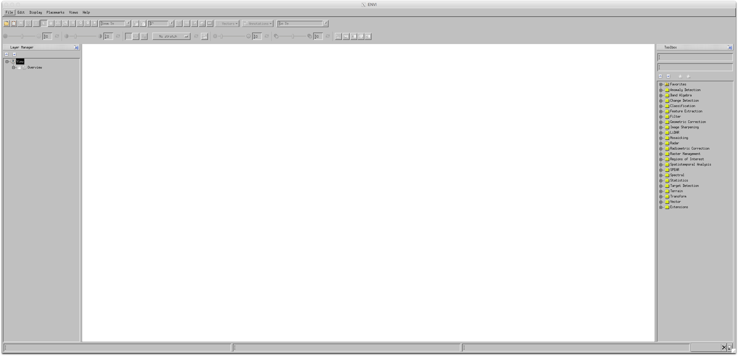
Starting ENVI on UCL Desktop reveals an empty display.
For personal machines or on a UNIX machine you get a similar display.
The first time you use the tool, you may find it convenient to update the default data location.
You can access this via the File->Preferences menu. Then select Directories from the left hand column. Select Input Directory, select the little arrow, and find the directory we made and put the data in earlier.
On UCL Desktop: this window: 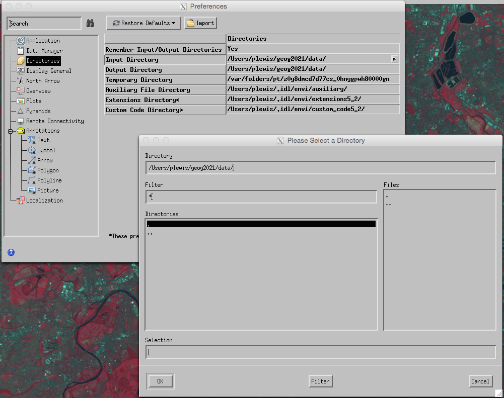
for UNIX/Personal
Typically, we will want to change the Input Directory and Output Directory to where you are currently working,
e.g. N:\GEOG0027\data on UCL Desktop Anywhere (where we save the data earlier, when navigating this will be under This PC), or /Users/xxxx/GEOG0027/data on a Mac, or /home/ucfxxxx/DATA/GEOG0027/data or similar on the UCL Unix system.
Make a note of where your image data are, so that you can find them the next time!
For versions below 5.5.3, you have to quit and restart ENVI for these changes to take effect.
You should now be able to open an image dataset: select File->Data Manager from the menu.
Click on the file tab, and choose an image file to open e.g. ETM-190600. Do not select the HDR files as these are header files. You may need to fist use the open icon (brown folder, top left) to find the file.
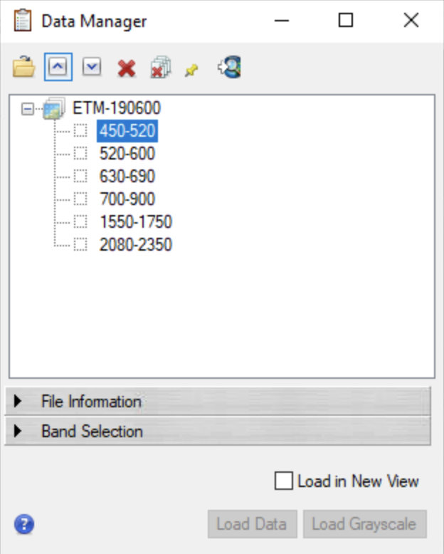
From which you can select one or more ‘bands’ to open and assign to the red, green and blue colour guns.
2.4. Exploration
*In this section, we use various tools for exploring the image*.
Once you have loaded an image, explore how to pan and zoom around the image
Whilst doing this, examine some of the features you see in the image:
The
crosshairscan be used (and/orcursor value, looks like a “dropped pin”) to explore the geographical coordinates and the digital number (DN) in the three wavebands you are examining.How do the DNs compare for lighter/darker regions of the image?
how could you check that the geographic coordinates seem sensible?
try to relate the visual cues you see in the data to the DN values being shown
use these ideas to interpret ‘colour’ as displayed in the image e.g. what does the ‘red’ colour mean and why is it so?
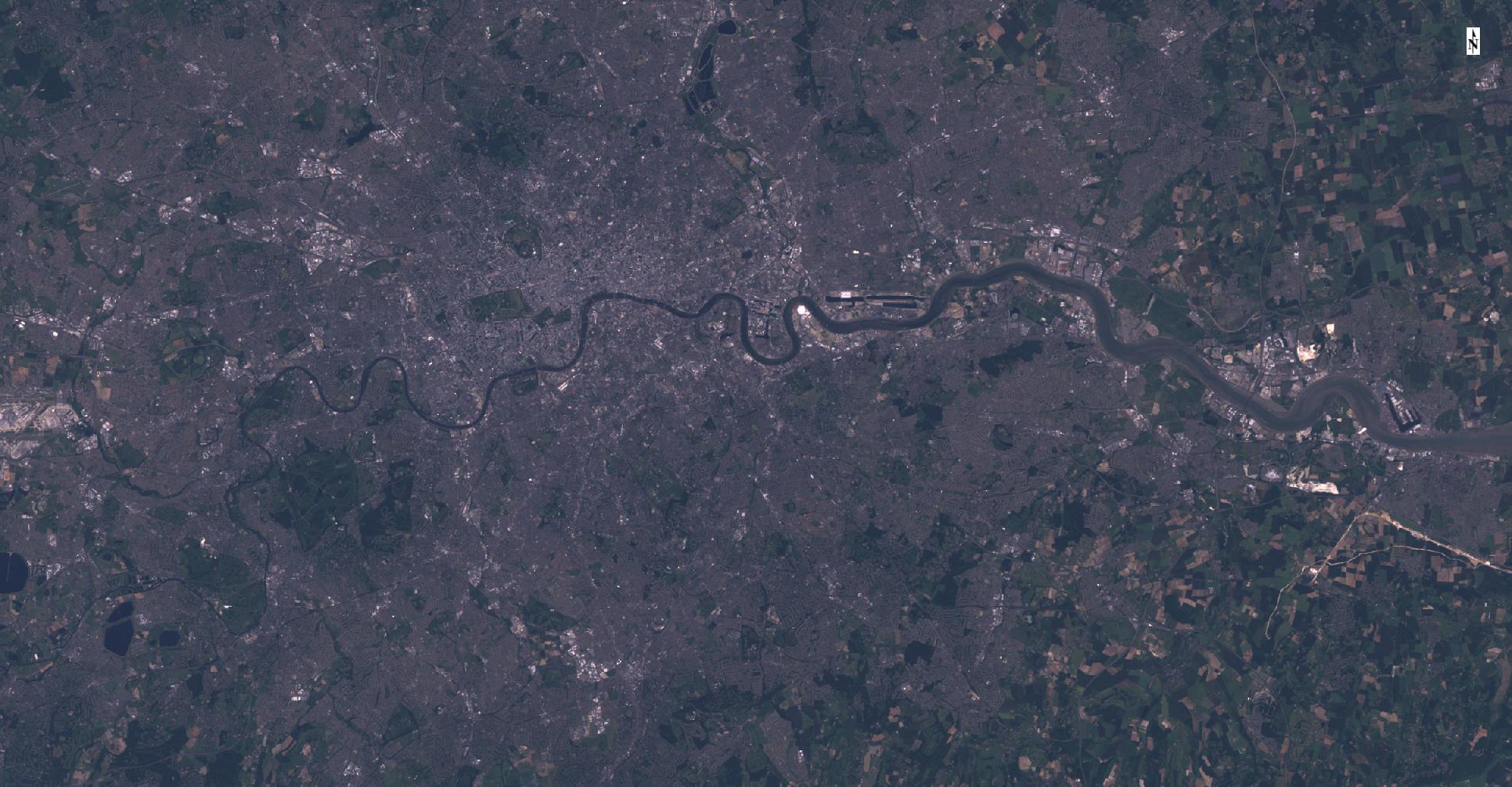
Find out how to Change RGB bands ... for the image you are viewing and use this to display e.g. a real colour composite.
Try some different band combinations and make sure you can interpret the colour you see
What happens if you put the same band onto R G and B? why?
*Make sure you make notes of what you have done and how you have done it so you can recall this later.*
2.5. Spectral Features
*In this section, we will learn how to consider spectral features and perform contrast enhancement*.
Clearly, we can ‘recognise’ much information in the image from spatial context.
But there are other ways we can visualise the data to aid our interpretation.
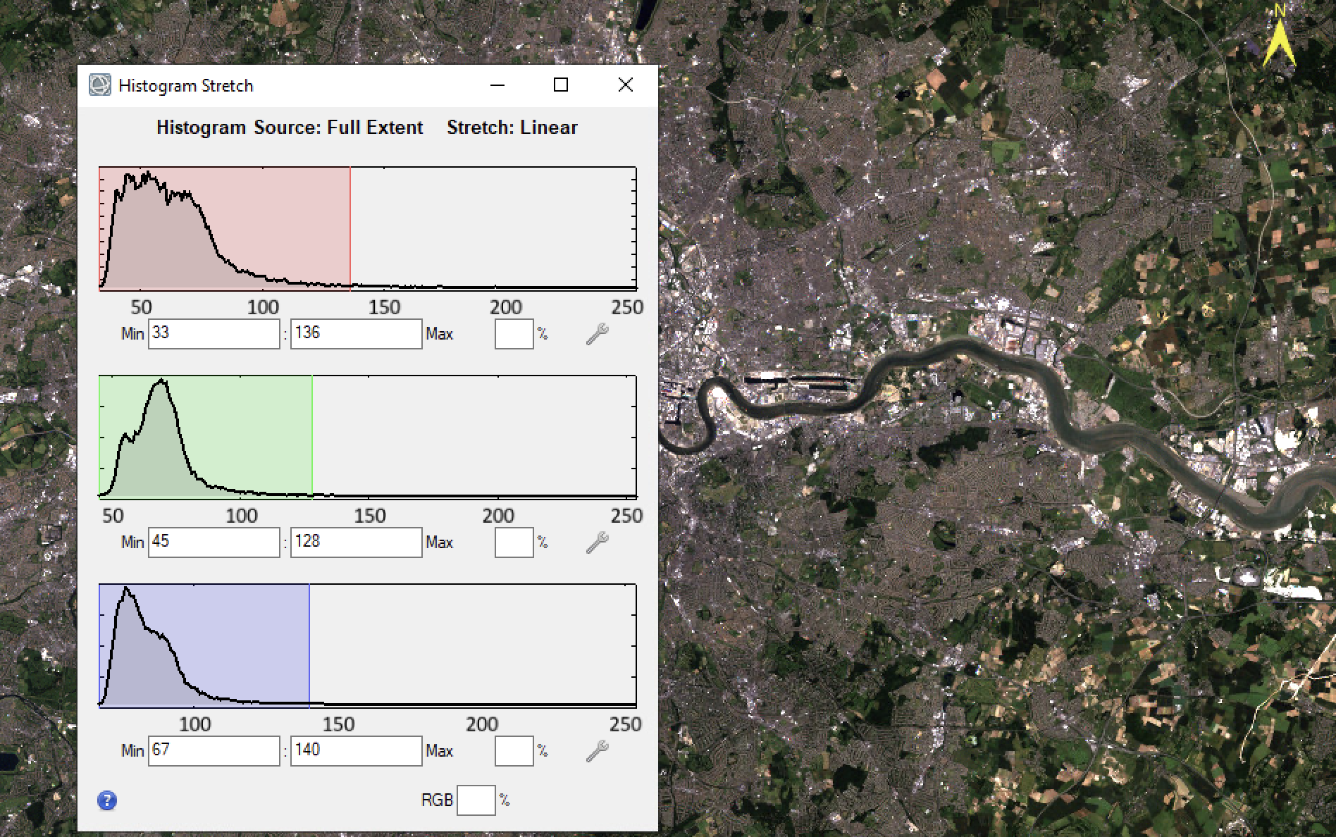
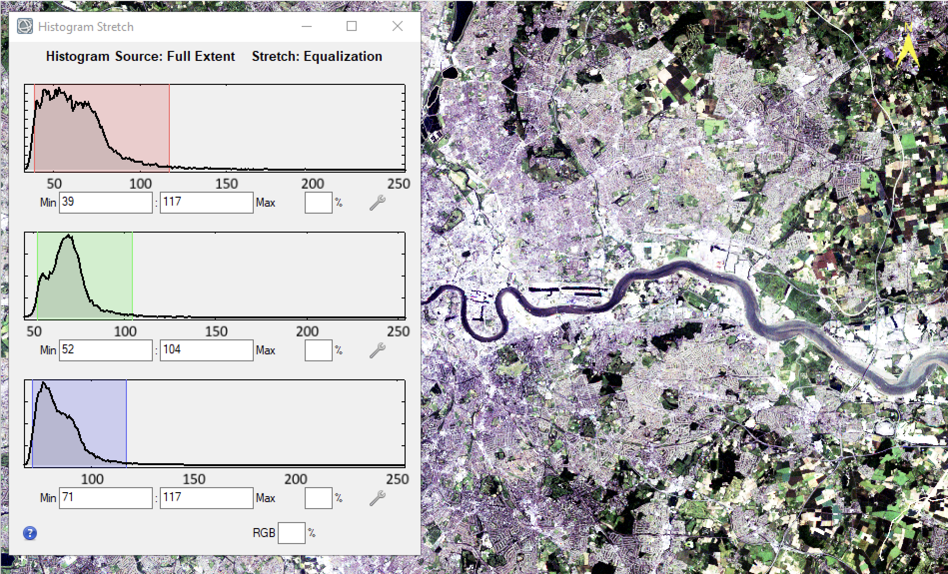
For example, if we select the Histogram stretch button: 
then we obtain a histogram view of the data, within which we can apply a contrast stretch by ‘moving’ the upper and lower thresholds.
For greyscale:
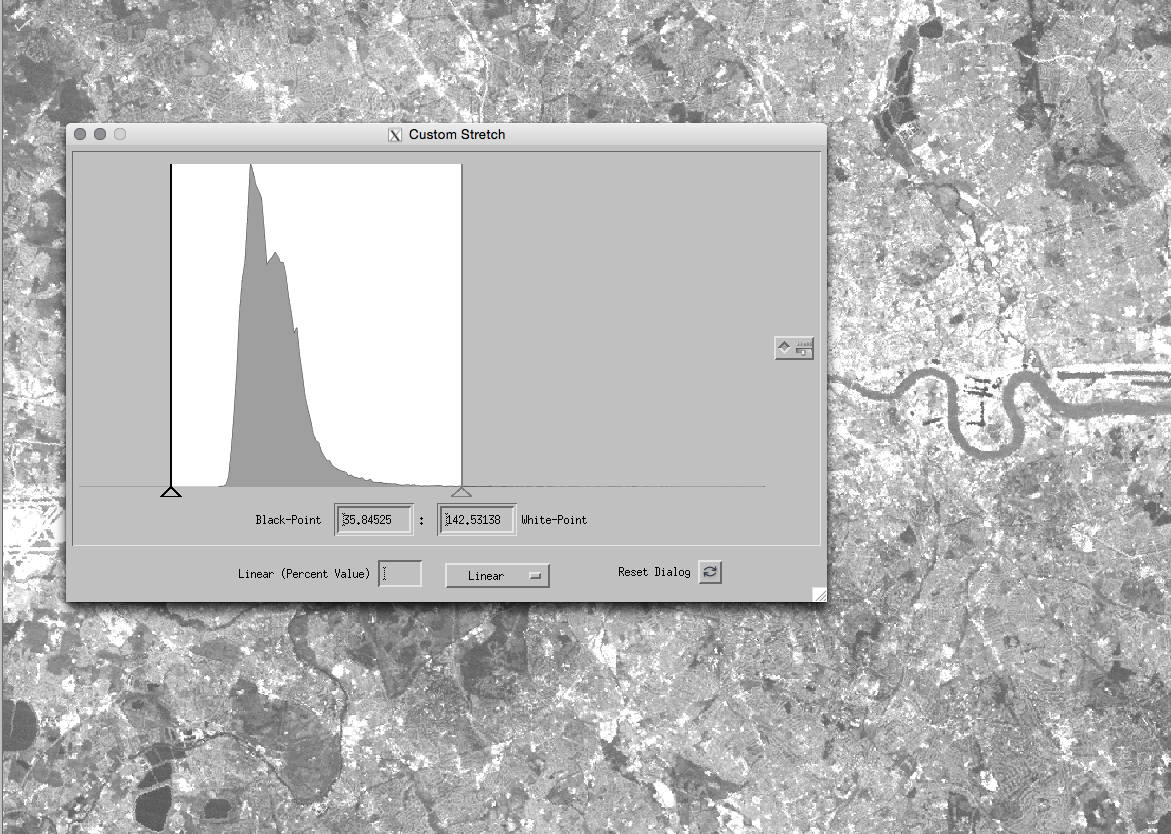
or three band colour:
This can be useful both for performing a contrast stretch
*experiment with this so that you understand what the linear contrast enhancement is doing to the image DN* You may find it useful to save some historgrams and images and put these in your notes. For UCL Desktop the easiest way to do quick saving is using screenshots. Find the On-Screen Keyboard and Paint apps. Use the combo of Windows-Icon+Shift+S, to start a screenshot on UCL Desktop, then go to Paint and Paste. The screenshot should appear in paint for you to
save. Make sure the On-Screen Keyboard doesn’t obstruct your image. You can also paste into a word doc if you want to take notes.
It is also of value in visualising the features of the histogram. The histogram shows the frequency of occurrence of the different DNs in the image. For example in the image above, we can describe the green waveband histogram (shown in green) as having two clear peaks and a long positive tail. The two peaks are most likely indicative of different land cover classes. The fact that there is a long positive tail may show a third ‘bright’ class present.
*explore the histograms shown by some of the wavebands you have access to here*
As you do this, think about the relationship between the informations shown in the image and that in the histogram.
How could you try to use the histogram to perform a classification on the image into different land cover classes?
What issues might you come across?
Do some bands show better separatbility than others? if so, which (and why?)
A histogram is a useful way of summarising the information in an image. In fact, we will often use even simpler descriptors to decsribe a frequency distribution such as this, one example being the mean and standard deviation. Would it be a good idea to describe these histograms in this way? If not, why not?
One way of extending our view of such summary data is to use a scatter plot (often called a ‘feature space’ plot). 
File->Select New Band
*locate the Scatter Plot Tool button, and display a scatter plot with the Red waveband (630-690 nm) on the x axis and the Near InferRed (700-900 nm) on the y axis*
Toggle the density slice button to show the scatter plot in colour (density slice)

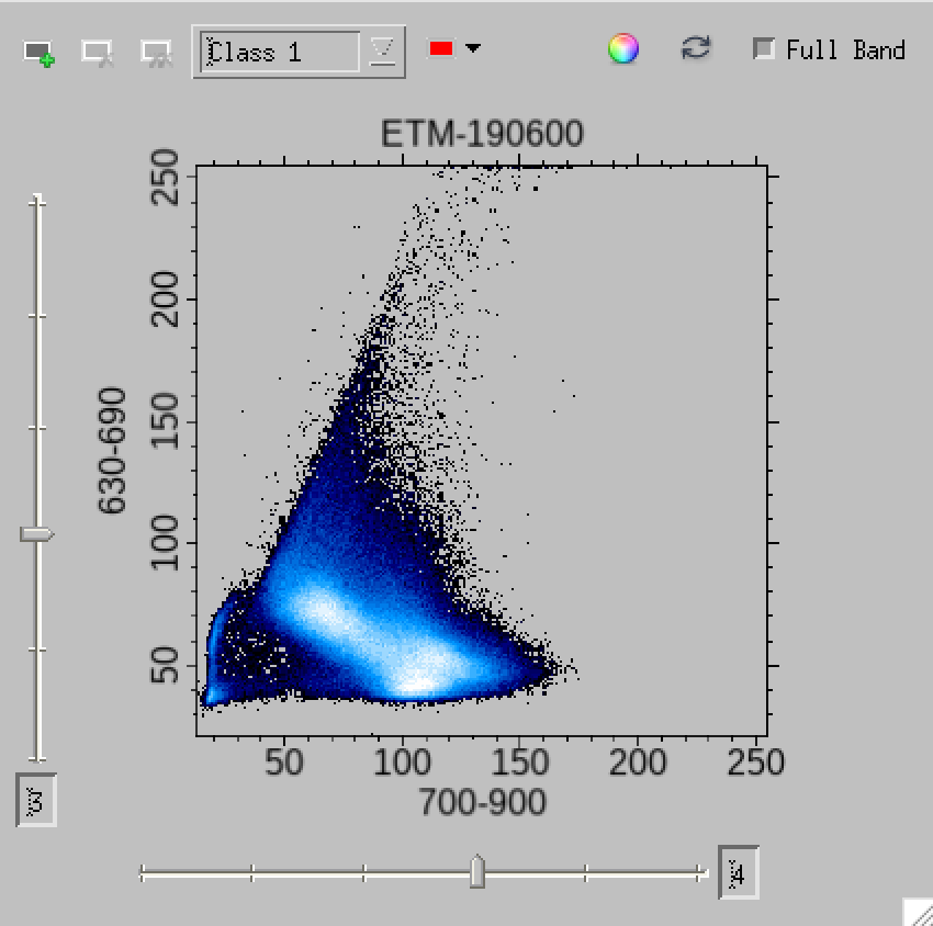
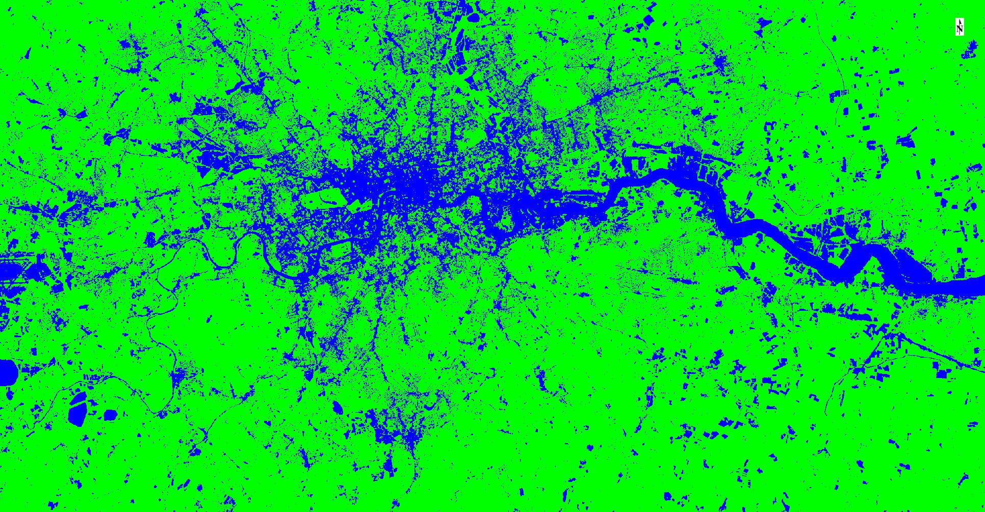
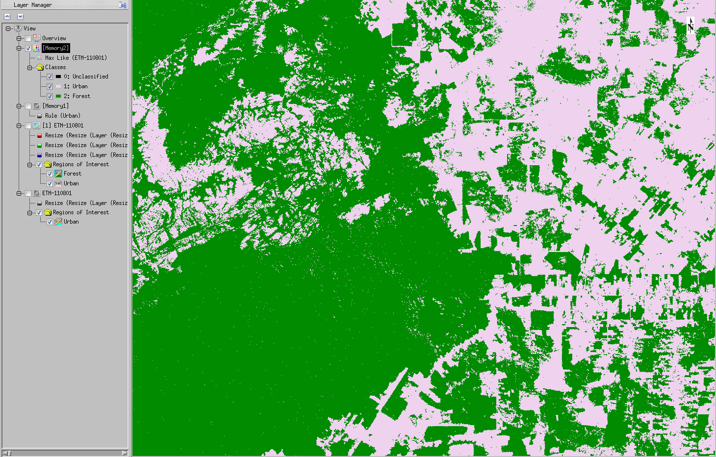
You should now be able to define (‘draw’) regions onto the scatter plot, and the pixels within this specified region are then displayed in the defined colour on the image:
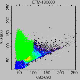
*You should spend some time exploring this for different wavebands, as this concept forms the basis of many remote sensing algorithms (particularly those for classification)*
As you do this, think about how the scatter plot and histogram information are related and also think about how you might get the computer to describe the regions you have drawn in the feature space plot.
Think also about how using only one or two wavebands may be a limiting factor in classification (i.e. there is often information in other bands that may allow separability).
Try using Options -> Mean All on the scatter plot tool. This shows you the class means across all bands. This should allow you to better think about how the classes you have drawn might be separable in different wavebands.
2.6. Spectral Profiles
*In this section, we will learn how to do plot spectral profiles*.
Note that you may need to close the scatterplot tool before doing this.
Although we can display (up to) three bands of information in a colour composite, we often wish to know more information.
The various Display->Profiles tools can help in this regard as we can look at the DN in all wavebands (for a particular pixel).
The following show some example spectral profiles:
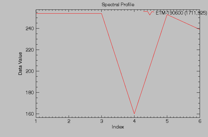
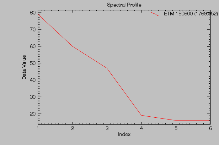
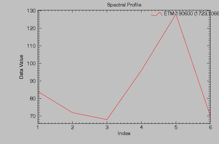
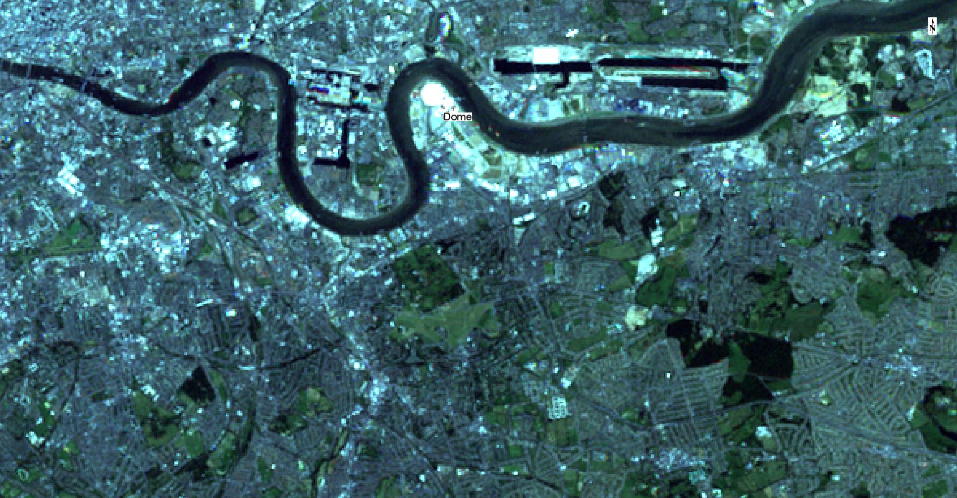
See if you can navigate your way to these locations and/or work out what ‘material’ is shown by the spectral profile. if you want to save these plots, make sure to give them a descriptive name that will make sense next time you find them.
2.7. Enhancement
*In this section, we will learn how to perform a variety of enhancement tasks*.
We have seen that ENVI has simple image display enhancement capabilities such as ‘brightness’ and ‘contrast’ variation via contrtol sliders. Open the Histogram stretch window to visualise the histograms again.
These are often useful first pass enhancement tools to enable you to more readily visualise features in the image.
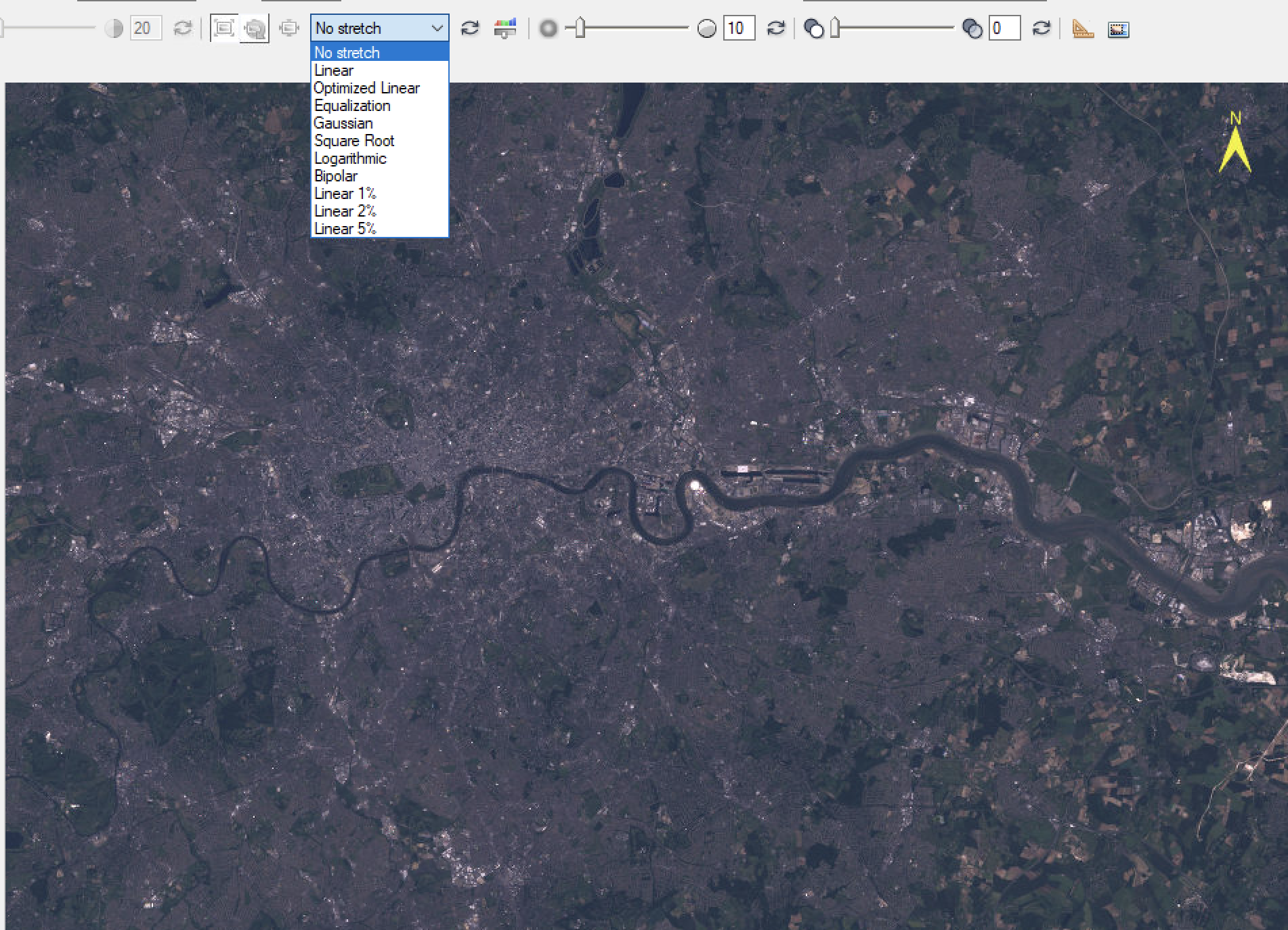
Several ‘automated’ or semi-automated approaches also exist that may provide a useful enhancement under certain conditions.
These are available via a menu (Linear being the default) as:
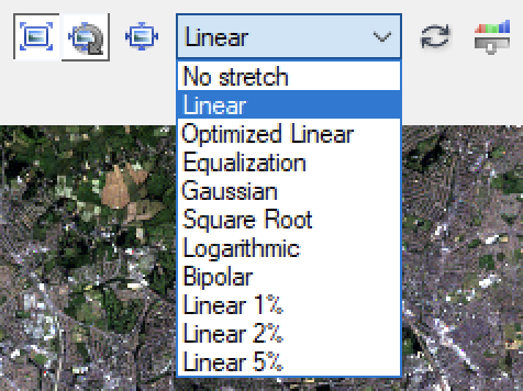
For example,histogram equalisation is generally a useful visual enhancement method:
*Explore the impact of various enhancement operations*
You may find it easiest to do this using a ‘greyscale’ representation (so there is just a single waveband to think about).
Think about how the different enhancements relate to the information in the histogram.
*In particular, explore how you can use image enhancement to more readily differentiate different DN levels in a particular area of the image (e.g. the river)*
2.8. Comparing Images
*In this section, we will examine some tools to use when comparing images*.
Often, we wish to compare features from more than one image (e.g. Landsat images taken over an interval of time).
There are several tools for exploring this in ENVI.
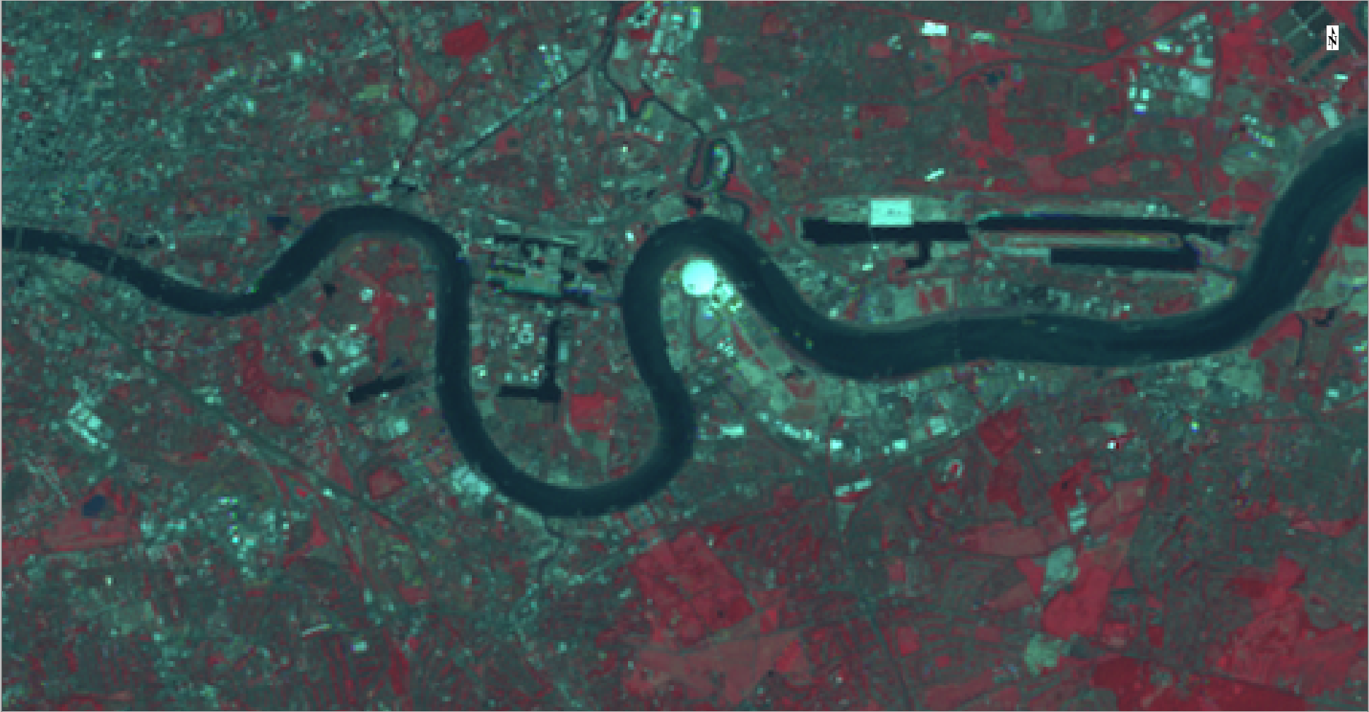
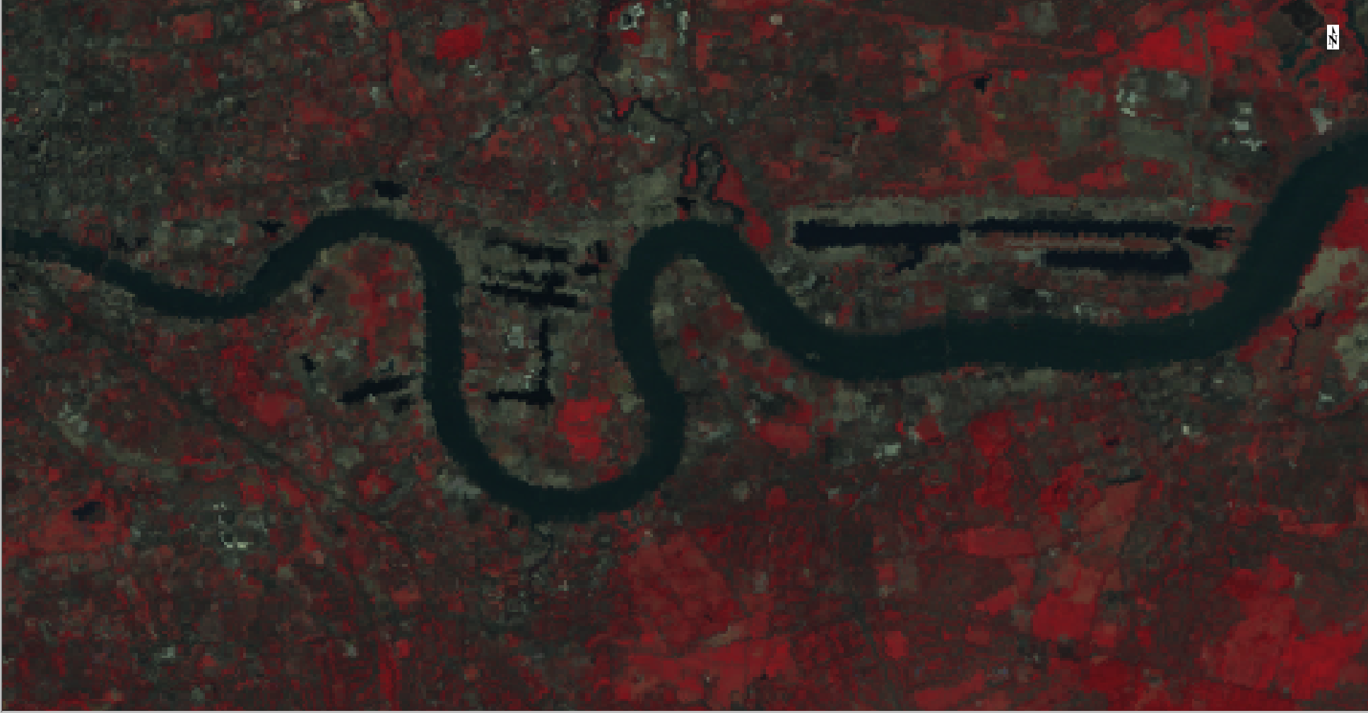
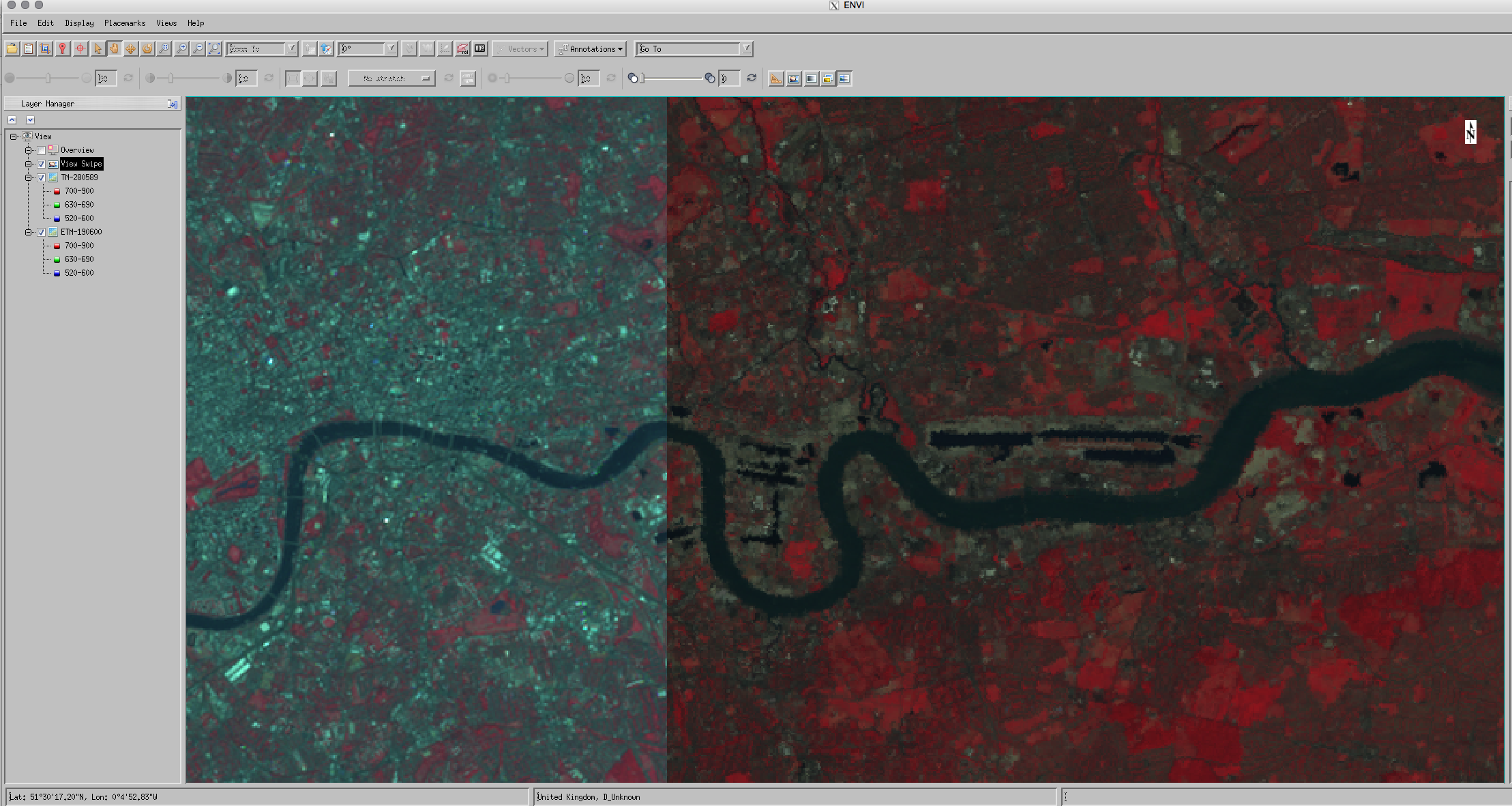
First, remove the current loaded images from ENVI (Note down how you do this!), then load two dataset ETM-190600 and TM-280589.
One immediately obvious thing you can do is simply toggle each dataset 'on and ‘off once it is loaded (using the dataset check box).
You can use tools we have seen above, such as the scatterplot to visualise the scatter between the two datasets (File->Select New Band):
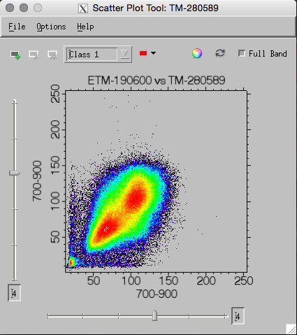
You can also very usefully ‘draw’ on this scatterplot to identify interesting features:
2.8.1. Transparency
Another option is to use the transparency slider  to give different ‘weights’ of the two datasets. This might be useful, for instance to spot features that have changed between the two image dates:
2.8.2. Swipe and Flicker
Sometimes it is useful to ‘flicker’ between the various images or ‘swipe’ one over the other to spot features of (change) interest.
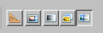
These can be done using the appropriate buttons on the command bar or under the Display option:
2.8.3. Views
One other option is to change the number of ‘views’ on the screen display:
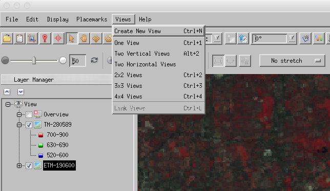
This will create new ‘views’:
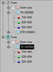
And you can drag and drop loaded datasets to the particular view you want.
*Use these various comparison tools to highlight areas of difference between the two images*
2.9. More Exploring
Some other interesting options to explore:
2.9.1. Annotation
On the control bar, you should see options for annotating the image. Experiment with annotating the image for a few features and work out how to save a ‘picture’ of what you have done (e.g. File -> Chip view to-> File ...):
2.9.2. Google Earth
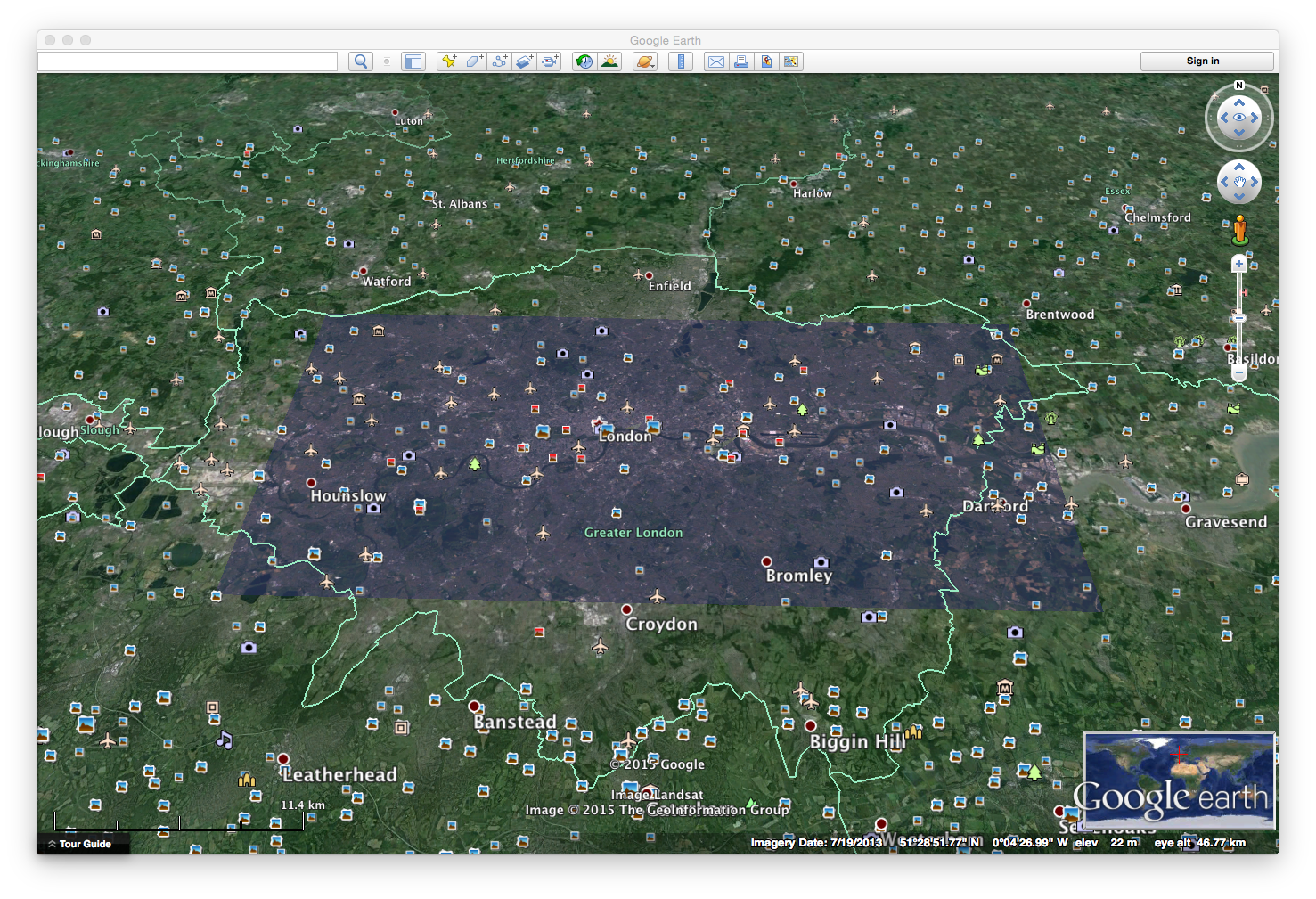
If you have tools such as Google Earth set up on the computer you are using, try File->Chip view to->Google Earth
2.10. Summary
The main aim of this practical is to get you used to using the image processing software tool envi.
In this practical, we have loaded two Landsat images of London and used various tools within envi to visualise the data and their information content.
In particular, we have learned about:
Image Display
False Colour Composites
Real Colour Composites
Greyscale display
Spectral profiles
Feature Space
Histograms
Scatterplots
Enhancement
Linear contrast enhancement
Histogram equalisation